
Blogs
High-Converting Landing Pages: A Framework for Paid Traffic
Author : Logicloop admin
Publish Date : 2026-07-22
You can have the sharpest ad creative, the tightest audience targeting, and a healthy media budget, and still lose money. Why? Because every click you buy lands somewhere, and that "somewhere" is where the sale is won or lost. When you're paying for each visitor, the page they land on isn't a nice-to-have. It's the single biggest lever between wasted spend and profitable growth.
This guide lays out a repeatable framework for building a high converting landing page specifically for paid traffic. This is the kind of page that turns expensive clicks into leads and customers. Whether you're running Google Search, Meta, or programmatic display, the principles below apply.
What Makes a Landing Page "High-Converting"?
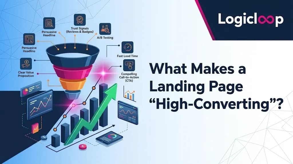
A high converting landing page is simply one that converts at a rate meaningfully above average for its context. It combines persuasive copy anchored by a clear value proposition, focused design, and credible social proof, all pointed at a single action you want the visitor to take.
To know whether your page is "high-converting," you need a benchmark. According to Unbounce's data, the average landing page conversion rate sits around 6.6%, meaning roughly 1 in 20 visitors completes the intended action. But averages hide a lot of variation:
- Ecommerce pages average around 4.2%
- Travel and hospitality pages convert near 4.8%
- Entertainment pages can hit a striking 12.3%
The takeaway: "high-converting" is relative. Lead-generation pages that require filling out a form typically convert lower than click-through pages with a simpler ask. And crucially, traffic quality drives conversion rate as much as the page itself. Poorly targeted ads send poorly matched visitors, and no amount of design polish will fully rescue a bad-fit click. That reality is exactly why a paid-traffic framework has to start upstream of the page.
Why Paid Traffic Changes the Rules
Organic visitors often arrive curious and patient. Paid visitors arrive with an expectation set by the ad they just clicked, and a much shorter fuse. Because you paid for that click, three things become non-negotiable on a ppc landing page:
- Continuity. The page must deliver on the ad's promise within seconds, or the visitor bounces and your money evaporates.
- Focus. Paid visitors came for one reason. Competing links and distractions dilute the conversion you already paid for.
- Measurability. Every element should be testable, because paid budgets reward the marketers who iterate fastest.
This is the difference between sending traffic to your homepage and sending it to a purpose-built page. A homepage answers "who are we?"; a paid landing page answers "should I take this one specific action right now?"
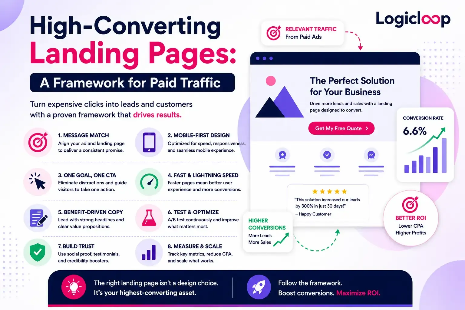
The Framework: Eight Steps to a High-Converting Paid Landing Page
Step 1: Win the "message match" before anything else
The most underrated conversion lever isn't on the page; it's the connection between your ad and your page. Unbounce calls this message match: when someone clicks an ad for, say, topographic hunting maps, they expect to land on a page whose headline and imagery immediately confirm they're in the right place. onX, a navigation brand, credited exactly this alignment, matching the search click with an exact visual cue, for a landing page converting well above average.
The related idea is conversion scent: keeping written and visual cues consistent across the entire journey, including the ad, the email, the creative before the page, and the page itself. The social media tool Later attributed a successful lead-gen campaign to maintaining this scent, so the offer a visitor saw in the ad matched what they saw after clicking.
Action: For each ad group or audience, the headline, offer, and hero image on your landing page should echo the ad. If your ad promises "Expert tyre fitting at your home," your headline should say close to that, not "Welcome to our website." This is the foundation of both message match and effective landing page optimization.
Step 2: One page, one goal, one call to action
Neil Patel's guidance is blunt: a landing page has a single purpose, which is to get people to act. The moment you promote two things, you weaken both. The "paradox of choice" applies here; too many options paralyze visitors rather than empower them.
For paid traffic, this means:
- Remove site navigation and secondary links that give visitors an exit ramp.
- Present one primary call to action, repeated as needed, not three competing asks.
- Make the CTA obvious in design (contrasting color, whitespace) and compelling in copy.
A descriptive CTA outperforms a generic one. Instead of "Submit," tell people what happens next: "Get my free quote," "Start my 14-day trial." The finance brand ooba used a descriptive button paired with a contrasting color so visitors knew exactly what action they were taking, a small detail that removes hesitation at the critical moment.
Step 3: Lead with a benefit-driven headline and a strong hero
Brian Clark, founder of Copyblogger, estimated that on average 8 out of 10 people will read your headline, while far fewer read the rest. That makes your headline the highest-leverage sentence on the page. It should state your value proposition in plain language: what the visitor gets, why they should care, and what makes you different.
Directly beneath it, your hero shot, the primary image or video above the fold, is the first thing visitors focus on. Show your product or service in the context of use so people can picture themselves getting the benefit. TyresOnTheDrive's page works because a single clear headline ("Expert tyre fitting at your home or work") instantly conveys the differentiator, backed by supporting proof.
Step 4: Speak to pain points, then sell benefits over features
Before someone converts, they need to feel understood. Patel's first rule of design is to understand your audience's pain points; offering a stomachache remedy to someone with a headache simply won't land. The Listings Lab's high-converting real estate page opens by naming the visitor's exact pain (cold calling, poor leads, long hours) and then presenting the guide as the alternative.
Once you've named the pain, resist the urge to list every feature. People care less about what your product does and more about what it will do for them. Benefits-oriented messaging is one of the most reliable ways to lift conversions. edX found that shorter, benefit-focused copy, such as a few crisp bullet points about what learners would gain, outperformed longer, detailed copy. As their marketer put it, either someone wants to learn the skill or they don't; extra detail rarely converts the undecided.
Step 5: Build trust with social proof
People are far more likely to act when they see that others already have and were happy. Testimonials, reviews, star ratings, "featured in" logos, customer counts, and case-study results all serve as credibility shortcuts. This matters even more when the offer sounds too good to be true. ClaimCompass, which helps travelers claim flight-delay compensation, leaned on media logos and brief explanations of how it works to make "free money" believable enough to convert.
Even a human face helps. In one A/B test cited by Patel, swapping a generic contact icon for a real person's photo drove 48% more conversions, because people connect emotionally with people. Wherever possible, use authentic imagery of your team or product rather than obvious stock photos; audiences recognize stock photography and it quietly erodes trust.
Step 6: Match your form (and friction) to the offer
Your form is where intent meets effort. The rule of thumb: the length of your form should match the value of what you're offering. Asking for a phone number and company size in exchange for a simple ebook spooks visitors. Later's lead-gen page kept the form short and only requested pertinent information, because the ask has to feel proportional to the incentive.
The flip side is also true. On ooba's home-loan page, a longer form actually built credibility, because visitors expected that getting pre-qualified for a mortgage would naturally require more detail. And Simply Business deliberately introduces its multi-step form after the click, so visitors clear the first mental hurdle before hitting friction, making them more likely to finish. For a paid cro landing page, form design is one of the highest-impact things you can test.
Step 7: Design for mobile and speed
Mobile isn't a segment anymore; it's the majority. Unbounce's 2024 Conversion Benchmark Report found that 83% of all landing page visits happen on mobile devices. If your paid page loads slowly or breaks on a phone, you're paying for clicks you can't convert.
The clothing brand Twillory goes further than responsive design, serving a stripped-down mobile experience that preserves visual appeal while ensuring fast load times on cellular connections. At minimum, confirm your hero, headline, CTA, and form all render cleanly and load quickly on a phone before you spend a dollar on mobile traffic.
Step 8: Test relentlessly (this is where CRO lives)
Great conversion rates aren't a finish line; they're a reason to keep testing. This is the heart of conversion rate optimization. onX credited A/B testing many different CTAs before finding the one that produced a massive click-through rate. Even FilterEasy, whose page kept beating every challenger, admitted they still weren't fully sure why it won, and kept testing anyway.
The honest truth from the practitioners: building a high converting landing page isn't an exact science. Best practices tilt the odds in your favor, but the only way to know you've reached your best page is to keep running experiments. To do this well, you need three tools working together: a builder to launch pages fast, an A/B testing tool to experiment without a developer, and analytics to compare conversion rates. Picking the right tooling early removes friction from every future test.

A Quick Landing Page Optimization Checklist
Use this before pushing any paid campaign live:
- Message match: Does the headline echo the ad the visitor clicked?
- Single CTA: Is there exactly one primary action, with navigation removed?
- Benefit-first headline: Would a stranger understand the value in five seconds?
- Pain point named: Does the copy show you understand the visitor's problem?
- Benefits over features: Are you selling outcomes, not specs?
- Social proof present: Testimonials, logos, reviews, or real faces?
- Right-sized form: Does the ask match the value of the offer?
- Mobile-ready and fast: Does it load quickly and render cleanly on a phone?
- Tracking in place: Can you measure conversions and run A/B tests?
Common Mistakes That Kill Paid Conversions
Sending paid traffic to your homepage. Homepages are built for exploration, not action. Every paid campaign deserves a dedicated, focused page.
Ignoring traffic quality. A low conversion rate is sometimes a targeting problem, not a page problem. Diagnose both before blaming the design.
Over-explaining. Cramming every feature and use case onto the page dilutes the one message that matters. Specificity converts; clutter doesn't.
Weak or generic headlines. With most visitors only reading the headline, a vague one wastes your most valuable real estate.
Treating launch as "done." The first version is a hypothesis. Without testing, you're guessing with real money.
How to Measure Success
Conversion rate is your headline metric, but interpret it against the right benchmark for your industry and page type rather than a universal average. Pair it with:
- Cost per acquisition (CPA): What you pay for each conversion, the number that actually protects your margin.
- Bounce rate: A spike often signals a message-match or load-speed problem.
- Return on ad spend (ROAS): The bottom line for any paid program.
A page that lifts conversion rate even a few points compounds across every dollar of media spend, which is why landing page optimization is one of the highest-ROI activities in all of paid marketing.
Final Thoughts
A high converting landing page for paid traffic isn't built on a single trick. It's the sum of aligned parts: an ad-to-page message match that keeps the promise, a laser-focused single call to action, benefit-led copy that speaks to real pain, credible social proof, a form sized to the offer, fast mobile design, and a genuine commitment to testing. Nail the fundamentals, then let disciplined CRO tell you what to improve next. Do that consistently, and your paid clicks stop being an expense and start becoming a system that sells for you around the clock.
Sources & Further Reading
- Unbounce, 15 High-Converting Landing Page Examples (+ Why They Work): https://unbounce.com/landing-page-examples/high-converting-landing-pages/
- Apexure, The Complete Guide to High-Converting Landing Page Design: https://www.apexure.com/blog/the-complete-guide-to-high-converting-landing-page-design
- Neil Patel, A Brief Guide to Designing High-Converting Landing Pages: https://neilpatel.com/blog/a-brief-guide-to-designing-high-converting-landing-pages/
FAQ
1. What is a high-converting landing page?
A high-converting landing page is a dedicated web page designed to persuade visitors to complete one specific action, such as filling out a form, requesting a quote, or making a purchase. It combines a strong value proposition, persuasive copy, focused design, and clear calls-to-action to maximize conversions.
2. Why shouldn't I send paid traffic to my homepage?
A homepage serves multiple purposes and encourages visitors to explore, while a landing page is built around a single conversion goal. Dedicated landing pages improve message consistency, reduce distractions, and generally deliver better results for paid advertising campaigns.
3. What is message match, and why is it important?
Message match means your landing page headline, visuals, and offer closely reflect the promise made in your ad. When visitors immediately recognize they're in the right place, they're more likely to stay and convert, reducing bounce rates and improving campaign performance.
4. How many call-to-action (CTA) buttons should a landing page have?
A landing page should focus on one primary goal. While the CTA button can appear multiple times throughout the page, every CTA should lead visitors to the same action. Avoid multiple competing offers that can confuse users and lower conversion rates.
5. What elements make a landing page convert better?
The highest-converting landing pages typically include:
- A benefit-driven headline
- Strong message match with the ad
- One clear CTA
- Benefit-focused copy
- Social proof such as reviews or testimonials
- A mobile-friendly, fast-loading design
- Continuous A/B testing and optimization
6. How much information should I ask for in a landing page form?
Your form should request only the information necessary for the offer. Simple offers like ebooks or newsletters should use shorter forms, while higher-value offers such as loan applications or product demos can justify asking for more details.
7. Why are mobile optimization and page speed critical for landing pages?
Most landing page visitors now come from mobile devices. A slow-loading or poorly optimized mobile experience increases bounce rates and wastes advertising spend. Fast loading times, responsive layouts, and mobile-friendly forms help improve conversions.
8. How can I improve my landing page conversion rate?
Improve your conversion rate by testing different headlines, CTAs, images, layouts, forms, and messaging through A/B testing. Regular experimentation helps identify which variations generate more leads or sales while reducing acquisition costs.
9. What are the most common landing page mistakes?
Common mistakes include sending paid traffic to your homepage, using weak headlines, cluttering the page with too much information, ignoring traffic quality, and launching without ongoing testing. Avoiding these issues can significantly improve campaign performance.
10. How do I measure the success of a landing page?
Track key performance metrics such as conversion rate, cost per acquisition (CPA), bounce rate, and return on ad spend (ROAS). Evaluating these metrics together provides a clearer picture of how effectively your landing page supports your marketing goals.
Popular Searches:
Digital Marketing Agency | Brand Strategy Agency | Influencer Marketing Agency | Google Ads Management Agency | Facebook Ads Agency | Instagram Ads Agency | Performance Marketing Agency | Website Development Company | SEO services in Mumbai